A UX Portfolio Is Not a Gallery
How to build a case study that shows your thinking, your research, and the value your design creates — not just the final screens.
The way we build digital products has changed. But one thing has not changed: good design begins with understanding people.
Today, tools such as Figma, Photoshop, Illustrator and AI can help designers create interfaces faster than ever. But creating attractive screens is only one part of User Experience Design.
At Arrow Multimedia, Hyderabad, we have been involved in design education since 2006, and we have seen this field evolve from earlier interactive technologies to mobile applications, modern web experiences and today's AI-assisted design workflows.
Through our experience, we have noticed a common challenge among learners: they can often create good designs, but they find it difficult to explain the thinking, research and decisions behind those designs.
That is why we believe a strong UX portfolio should not simply display screens. It should show how you think, what you discovered, why you made your decisions, and how your solution creates value for both the user and the business.
Students can design attractive screens. They can create prototypes. But when someone asks, "Why did you design it this way?", the portfolio often becomes weak.
A UX portfolio should demonstrate thinking, not just output.
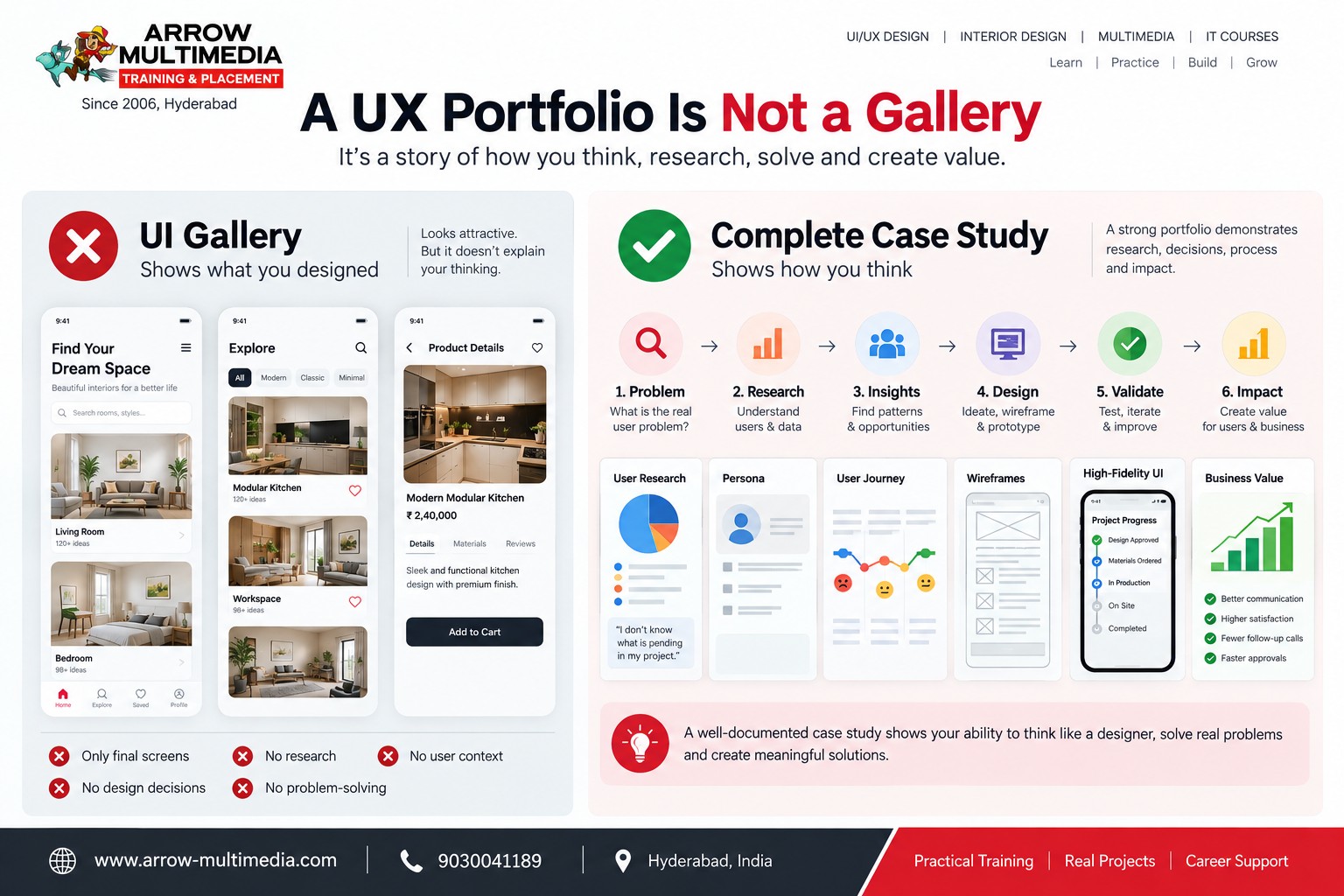
UI Gallery — "What I designed"
- 4–5 beautiful screens
- No explanation
- Only final screens
- No research or problem-solving shown
UX Case Study — "How I think"
- Problem
- Research & Insights
- Decisions & Wireframes
- Testing & Final Solution
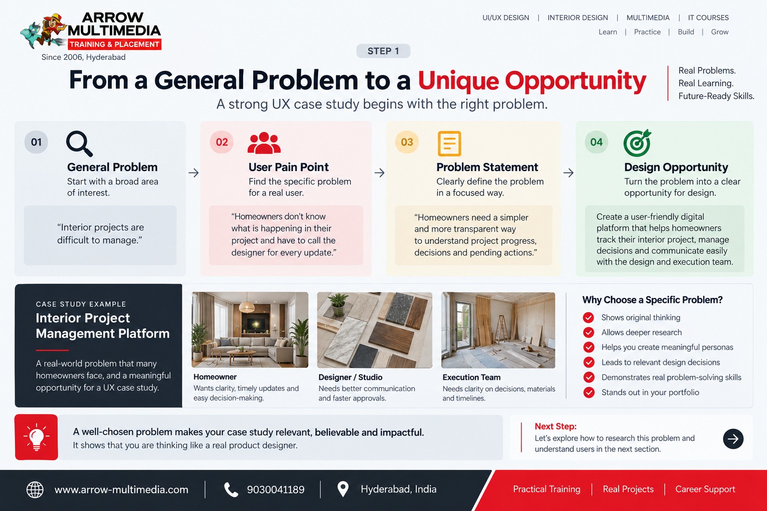
Start with a real problem, not a redesign brief
Here we introduce our continuous case study — an Interior Project Management Platform.
Instead of saying, "Let's redesign an interior design app," we ask a sharper question:
"How might we help homeowners understand what is happening in their interior project without constantly calling the designer or site team?"
This framing is a stronger starting point for a portfolio because it forces you to identify:
- A real user
- A specific pain point
- A measurable problem
- A design opportunity
The evidence behind the design
This should be one of the strongest sections in any case study.
Qualitative
- Interviews
- Observation
- User conversations
- Open-ended questions
Quantitative
- Surveys
- Ratings
- Task frequency
- Time & percentages
Raw Data → Patterns → Insights
Research is not something we add to make a portfolio look complete. Research should change the direction of the design.
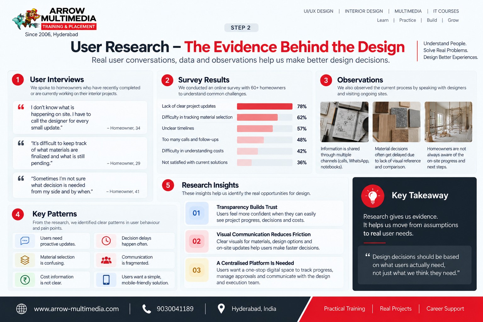
"I don't know what is pending." "I have to call the designer for every update."
Learning from what already exists
A competitor study isn't "Competitor A has this feature." It's:
What are competitors solving, what are they missing, and where is the opportunity?
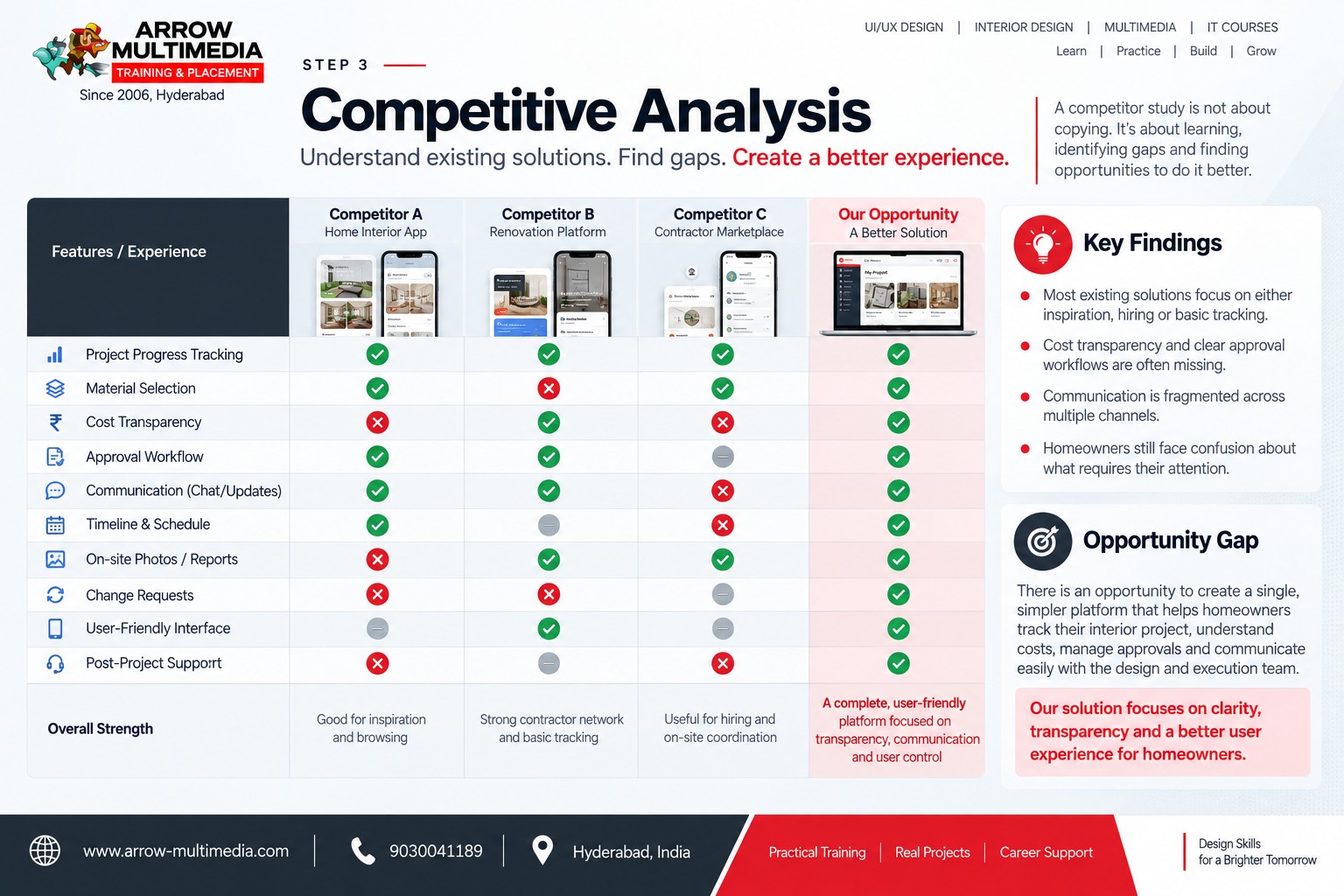
A professional matrix compares 3 existing approaches or products across dimensions such as:
- Project updates
- Material selection
- Approvals
- Cost visibility
- Communication
- Notifications
- User control
One clearly highlighted conclusion — the single most important gap your design will address.
Build the persona from the research, not before it
Once patterns are clear, the persona should emerge from them — not be invented as a random character first.
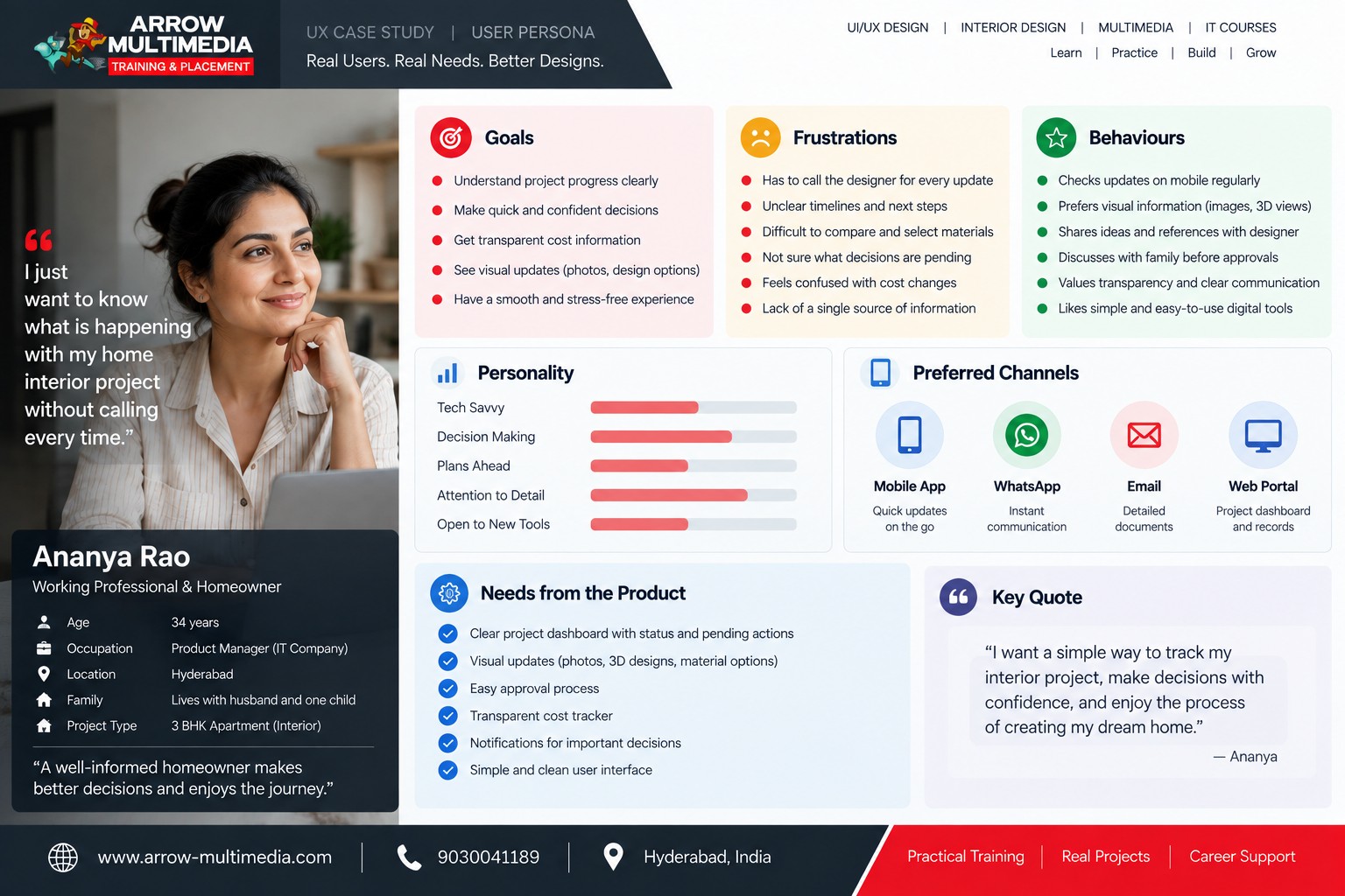
Understand project progress · Make decisions quickly · Control cost
Too many calls · Unclear updates · Difficult material decisions
Checks updates on mobile · Shares references with designer · Wants visual confirmation
Name + Role → Short quote → Goals / Behaviours / Frustrations → 3–4 data indicators
Going one level deeper
The empathy map content should come directly from the research and persona — never invented separately.
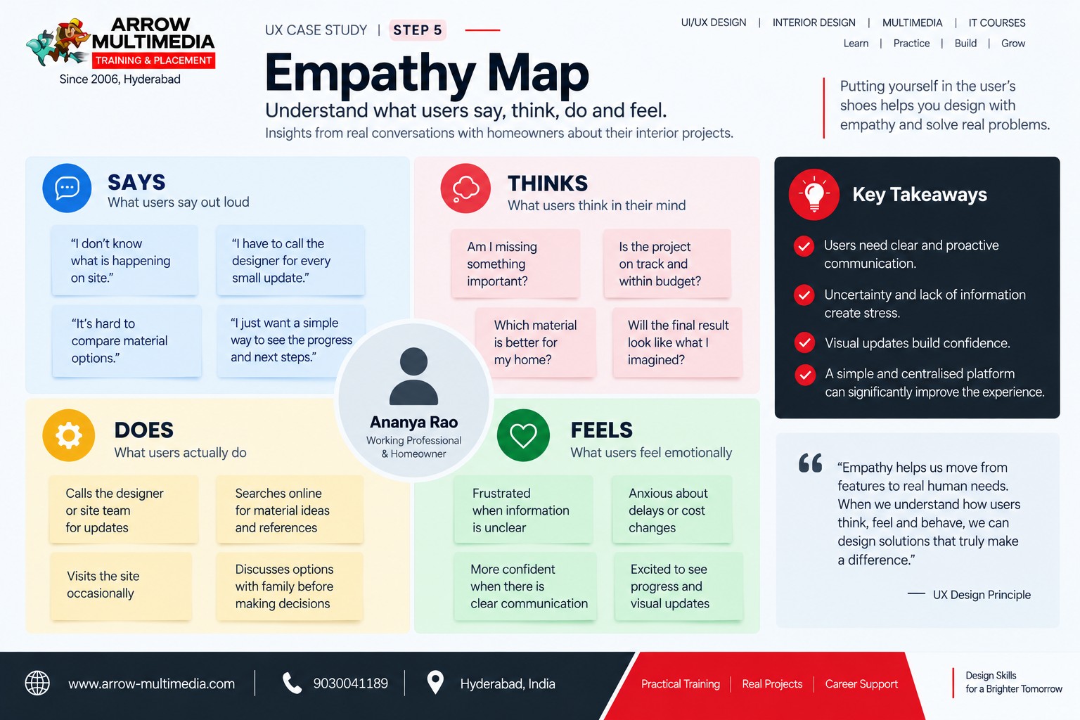
"I just want to know what is happening."
"Am I missing something?"
Calls the designer for updates.
Uncertain when decisions are pending.
Finding the real pain point
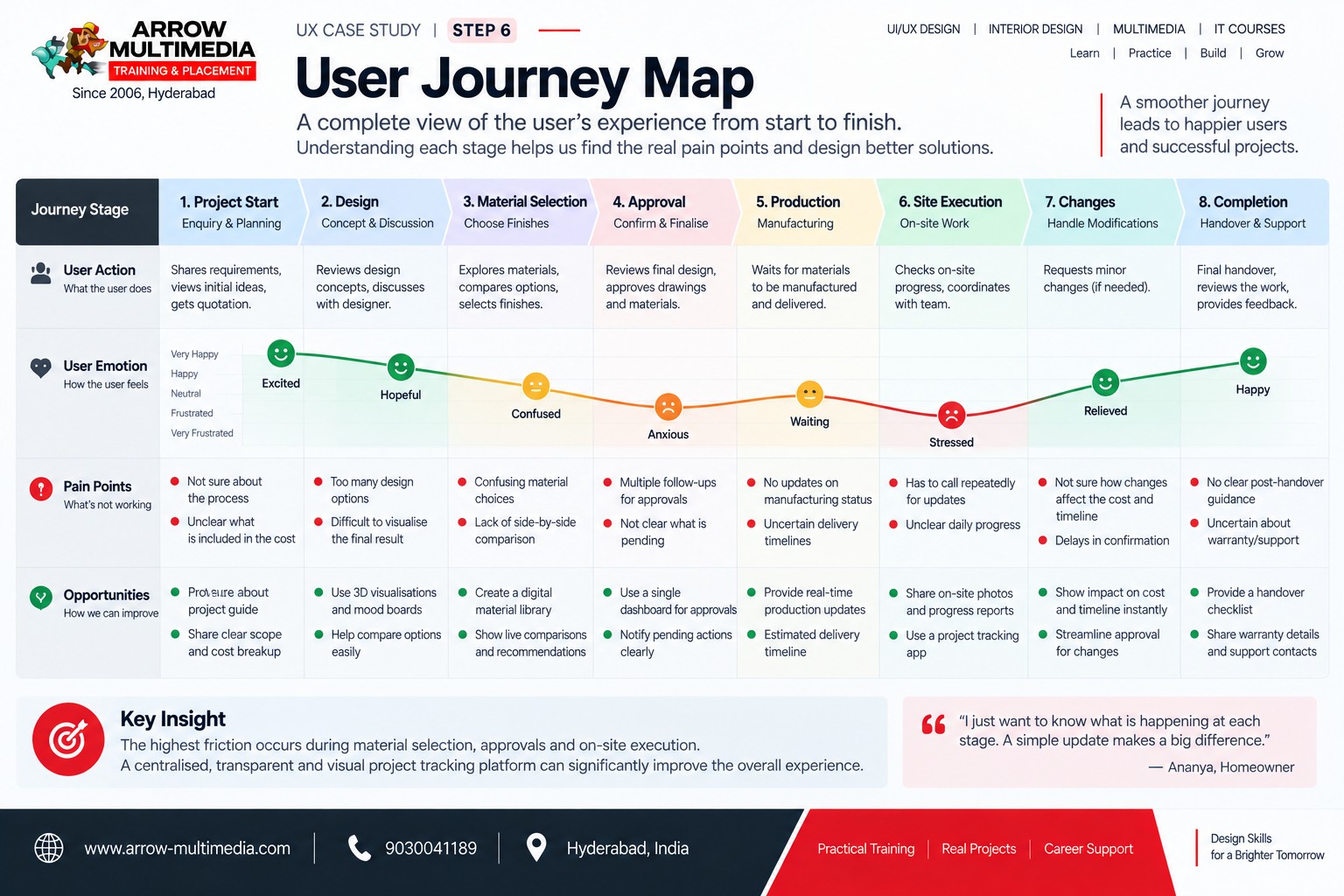
Take the persona through the actual experience, stage by stage:
Project Start → Design → Material Selection → Approval → Production → Site Execution → Changes → Completion
For every stage, document: Action | Emotion | Pain Point | Opportunity — then identify the single highest-friction point.
Start with the problem, not the software
At Arrow Multimedia, we encourage students to start with the problem — not the software. Figma is an important tool, but it comes after understanding the user, the problem and the evidence behind the design.
With more than 20 years of experience in design education since 2006, Arrow Multimedia has seen the design landscape move from earlier interactive technologies to HTML5, mobile applications and today's AI-assisted workflows.
Our practical approach is built around case studies, research, design thinking and the way working designers approach real product problems.
Finding the problem is only the beginning. In the next part, we take this case study from research into action — sketches, user flows, wireframes, UI design, design systems, prototyping, usability testing and finally the business value of the product.